The design problem is to construct an ad for the non profit organization The Humane Society of the United States. This design is developed in order to attract the appropriate target consumer so they can volunteer, donate, or invest in the organization. The process begins with researching headlines, taglines, competitor ads, demographics, and psychographics. This information is put into a targeted persona to gain an aspect of who the organization targets and what their voice, tone, and brand personality should entail. The persona is used to generate concept sketches for the print ad and digital draft along with rationales to validate the reasoning for imagery, font, and color choices. After peer reviews, the feedback was used to improve upon the draft and develop a final product.
Problem Solving
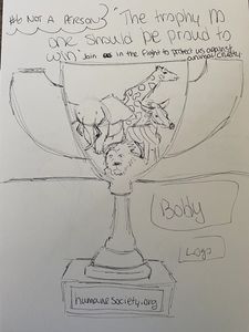
Concept drawing
In the concept sketch for the ad, a trophy connects with both personas due to its simplicity and obvious imagery. This ad uses Felton’s fifth personality of Something Associated with the Person (2013). By using an object, Felton exclaims that “there is an extra poignancy to this use of metonym- a part standing for the whole”, which makes using the trophy, instead of the physical hunter, more relatable (2013). The image is of a trophy with commonly ‘trophy hunted’ animals blended into the gold top with the headline “The trophy no one should be proud to win” sends the direct message better than a hunter would, since they are not well known. The common trophy item makes the ad more relatable even though it portrays a negative effect on the reader. The main focus of this ad was to not only have people donate but also raise awareness for animal cruelty from trophy hunting.
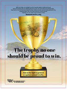
digital draft
Revisions
1. Updated the body copy to relate more directly to each of the images/headline.
2. Reworked color scheme to match organization (navy blue and white).
3. Modified the hierarchy of headline and subheading.
4. Used consistent fonts through all three advertisements.
(Impact- headline, Myriad- sub and body copy)
5. Removed background, keep simple with only inserting trophy/animal image.
6. Used tagline for the subheading.
Research

headlines & taglines
The IKEA print ad attracts the reader’s attention because the headline is relatable to almost all consumers. Everyone argues with someone (family, friends, coworkers, etc.) and no one enjoys doing so. By writing ‘fighting is inevitable’ as the headline, it grabs the attention of the viewer and forces them to continue to read the body copy in order to completely understand how the headline relates to a product from the company. They use Rieck’s 8th strategy to relay an honest, enthusiastic testimonial (Rieck, 2019).
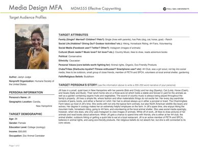
targeted Personas
The target profile allowed for more of a relationship between the specific audience and the organization. By creating the personas, it was easier for me to develop a visual in mind for who will be reading the ads and who will be most likely to donate to the organization. To do so, I used Felton’s needs of nurturance, understanding, and security (2013). Nurturance is viewed in the personas by their love for animals and caring for them. Understanding is shown because they both have an interest to learn more about the specific cause. Last, security is presented in their passion for animals and willingness to help others. These needs became qualities for the personas which aided in the direction of the campaign- love, selflessness, and passion.
Innovation
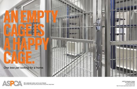
Competitor's ad
One of the organization’s top competitors is ASPCA. The ad can be found in the Love and Belongingness needs category on Maslow’s Hierarchy of Needs (Felton, 2013). The print ads may not necessarily be focusing on intimacy with others, but a profound love and affection that animals can provide for their human companions which can fulfill the need to be valued.
The print ad for ASPCA (Behance, 2016) displayed Settle & Alreck’s needs of Succorance and Novelty (1986). They use Succorance in the title of the ad by persuading viewers that they need help from them to adopt animals in order for the cages to be empty. ASPCA also uses Novelty in this print ad by surprising the viewers with no images of animals.
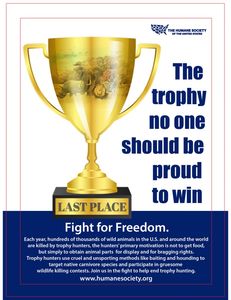
final digital draft
The tagline uses Felton’s strategy to rally the troops (2013). The statement becomes a command when someone who is passionate about animals reads the tagline. Swartz also references the use of alliteration meaning (2006). With all the words starting with the same letter causes a recurrence of consonant sounds which generates an ‘easy to say’ tagline.
The headline uses Felton’s technique “opposition” by saying what it cannot be (2013). The body copy uses a lead to transition out of the headline and into the in-depth explanation. The middle of the body copy provides an explanation and further details about the organization. Last, the close explains what the organization wants you to do based on their needs, in this circumstance it is to donate.
References
Behance, & Oshatz, G. (2016, April 4). ASPCA Print Ad Campaign. Retrieved August 03, 2020, from https://www.behance.net/gallery/35752345/ASPCA-Print-Ad-Campaign
Felton, G. (2013). Advertising Concept and Copy (Third ed.). New York, NY: Norton &
Company.
Rieck, Rick. “Headline writing basics: what every headline should do and 9 proven ways to do
it.” Retrieved from: <http://www.directcreative.com/headline-writing-basics-what-every- headline-should-do-and-9-proven-ways-to-do-it.html>
Settle, R. B., & Alreck, P. L. (1986). Why they buy: American consumers inside and out. New York, NY: Wiley.
Smallish, C. (2013, August 16). Developing Ideas and Advertising Concepts - Reflecting on the
process path. Retrieved August 13, 2020, from
Smallish, C. (2014, May 27). Designing a Print Ad - Presenting to the client. Retrieved August
13, 2020, from https://www.linkedin.com/learning/designing-a-print-ad/presenting-to-the-client?u=50813145
This website uses cookies.
We use cookies to analyze website traffic and optimize your website experience. By accepting our use of cookies, your data will be aggregated with all other user data.